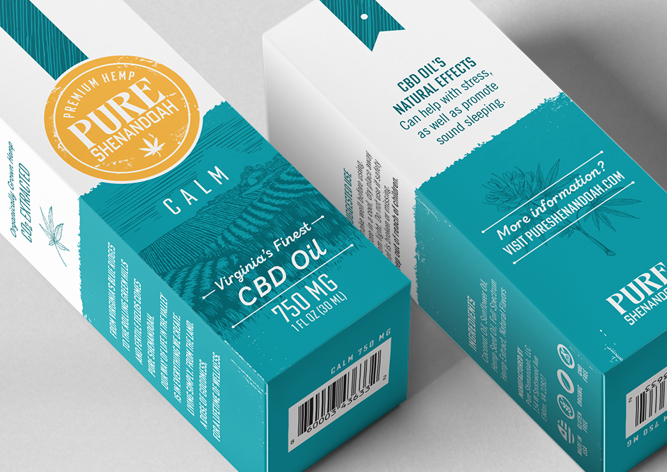
At the beginning of the creative process, we saw an opportunity to connect two key differentiators to the overall brand narrative. The first being the brothers’ mission of producing premium quality CBD products. The second was their deep pride in farming and dedication to continue the Shenandoah Valley’s rich agricultural legacy. The first creative decision was to change the brand name from Shenandoah Valley Hemp to Pure Shenandoah; the new name was more representative of the product quality and spoke to unspoiled splendor of the land from which the hemp is grown.
The new brand name combined with the premium product quality helped drive the design approach for the packaging. We wanted to incorporate the visual vernacular of traditional farming with a twist. On the box, the brand logo is held within a distressed circular seal, reminiscent of the warm sun rising above the etched-style illustration of rolling farmland. Distressed textural accents further echo rustic farm life. The vibrant color palette paired with bright white is a fresh contrast that complements and elevates the family of products — and helps Pure Shenandoah stand out on the shelf from its competition. Overall, the packaging design communicates that the brand is rooted in the authenticity of its origins. It now instills consumer trust and confidence in a burgeoning and crowded product space.