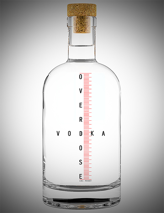
With nothing else to go on, I resorted to something I learned years ago in art school – taking a look at the letters involved, V-O-D-K-A. I spotted the OD right away and thought the name OverDose Vodka would certainly be aggressive, and edgy. The client agreed.
I designed from there. I decided a “Medical/Pharmaceutical” look would enhance the concept of overdose. I achieved this by using medical/pharmaceutical graphics – such as the graduated volume lines that are printed or etched on the barrel of a syringe and other equipment. Along with the simple straight forward typography that is typically used on measurement devices. I felt this sort of antiseptic look and the clear liquid of vodka, demanded a clear bottle with the graphics printed directly on. Lastly, I felt the cork stopper gave the bottle a warmth that helped offset the antiseptic look and signaled this was indeed a beverage and not a medical/pharmaceutical product.