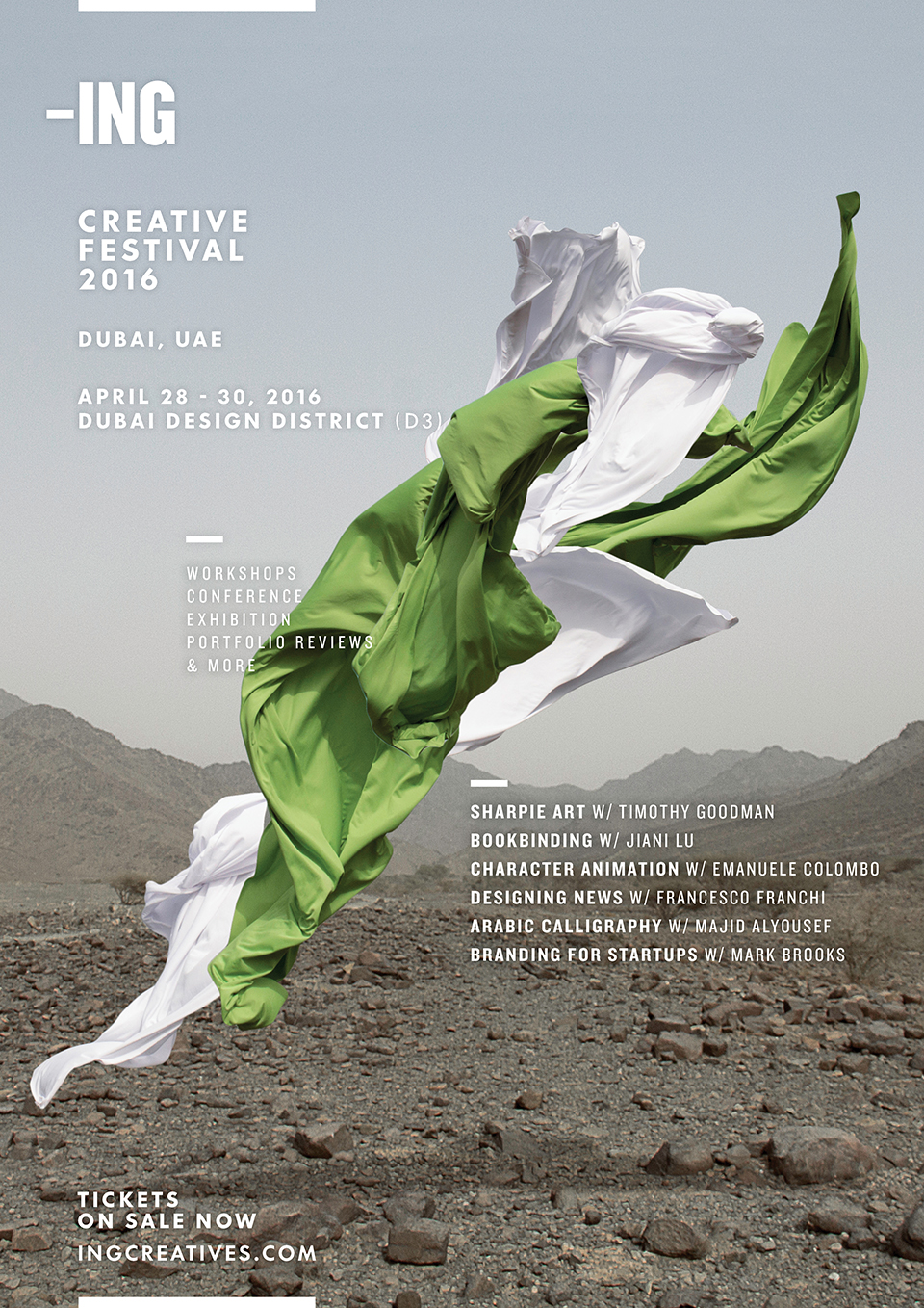
We referred back to the previous year's campaign imagery which featured dynamic exploding colours against open natural landscapes true to Dubai the region. These elements of bold vibrant colours, surreal compositions and natural backdrops were visual characteristics we aimed to connect through to this succeeding conference.
The photos were captured in settings that resonate with Dubai, the region and local residence. We identified authentic landscapes - avoiding typical touristic Dubai landmarks and instead opting for boundless sand-dunes and mountainous barrens.
A colourful selection of sheen fabrics were used; involving hundreds of attempts in throwing the fabrics up in the air to capture a large spectrum of dynamic shapes and forms. The final images are a result of multiple takes layered in surreal compositions.
The poster designs involved defining the positioning of static elements that remain consistent from poster to poster, and flexible elements that could be freely adopted based on the fabric visual used in each poster. Primary information such as the logo, festival date and location are consistently placed in the left column. While secondary information such as attending speakers, and workshops are flexibly positioned to maximize the impact of the fabric photography.